Delta Upgrades, New VPVR Modes, Chart Pane Management
Today's update puts volume delta front and center, with new VPVR modes, enhanced default Volume, plus a new dedicated Delta layer. All wrapped up within new pane management options for your chart. Let's go through each new feature and improvement in detail.
🚀 Delta Upgrades
Market orders are ultimately the trigger for a transaction or trade to occur. Assessing market buy volume and market sell volume can reveal key insights from an order flow and liquidity perspective. One such assessment is the Delta of market buy volume and market sell volume. This is calculated by subtracting market sell volume from market buy volume. The difference between the two is commonly referred to as the volume delta. A positive value indicates greater market buy volume, whereas a negative value indicates greater market sell volume. Today's update focuses on using volume deltas in a variety of different methods.
⭐️ New Delta Volume Layer
Previously within the CVD - Cumulative Volume Delta layer, you had the ability to enable a histogram mode, to display the net delta for each candle. After implementing enhanced delta volume sampling within the candlestick upgrades to CVD, the ability convert the ability to a histogram was removed.
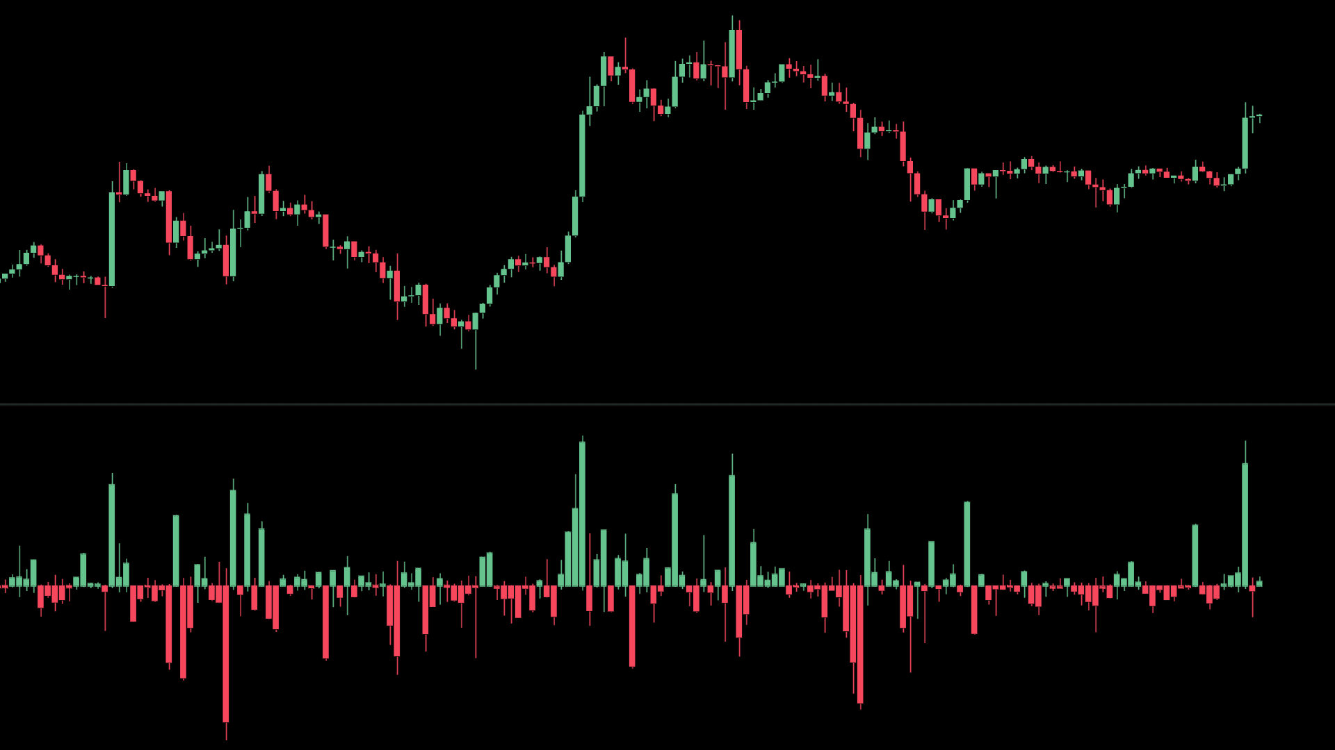
This update brings it back to the Market Monkey Terminal better than ever, with the ability to view the entire rotation of delta within the lifecycle of the candle. Within its very own dedicated layer called 'Delta Volume', view how the flow of market buy and market sell volume created possible swings in delta on an intra-candle basis. Rather than just one single net delta value, these additional 'wicks' crucially also provide the minimum and maximum delta that was recorded. Large swings in min/max delta particularly after sustained pressure in either direction can at time indicate a possible reversal.
⭐️ Enhanced Default Volume Layer
Prior to today's update, the 'Volume' layer that is part of the default chart template displayed volume in two parts. Anchored to the bottom of the price chart was market sell volume vertically stacked above market buy volume. Although the separation of both did provide the ability to visually compare either as a proportion of total volume (or each other respectively), we felt that these visual comparisons could be greatly improved.
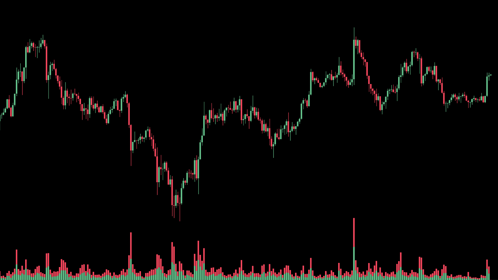
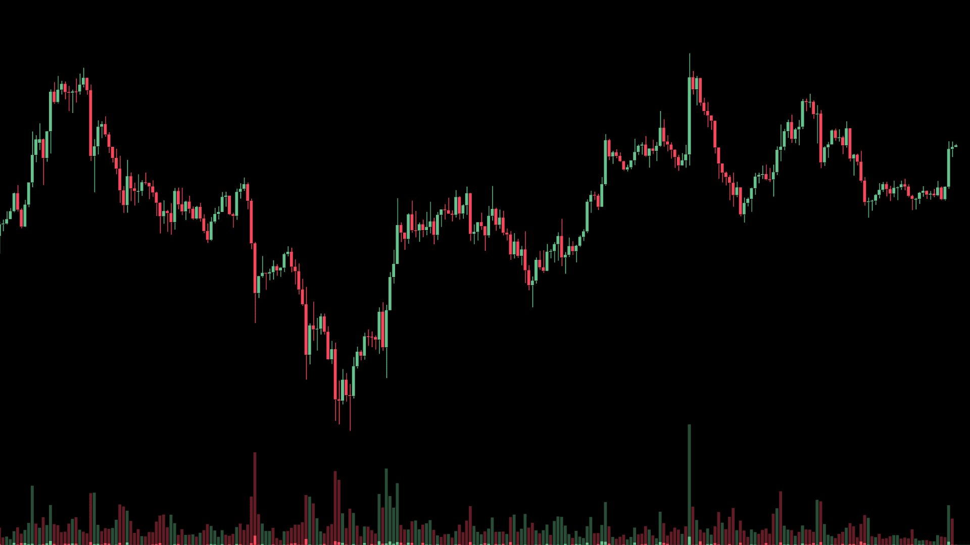
← New Volume Layer vs Old Volume Layer →
From today, Market Monkey's default Volume indicator now has 3 key enhancements.
- The color of each bar is determined by the delta of market buy volume and market sell volume. By default, green if greater market buy volume, red if greater market sell volume.
- The darker colored bar in the background, represents the total volume of both market buy and market sell volume.
- The brighter colored bar in the foreground, represents the net delta of market buy and market sell volume.
Visually, these enhancements provide improved visual references when perform the same comparative assessments of deltas, total volumes (and their proportionality of one another). Given this 'Delta Highlight' mode has replaced the previous version, it will now be the default mode for the 'Volume' layer.
Standard Mode
As an alternative, this update also allows you to display Volume as 'traditionally' shown in most charting platforms. Within this 'Standard' mode, a single bar is printed for each candle, with height representing the total volume traded. The color is determined upon the associated candle's open and close price. If the associated candle close was higher than the open - the volume bar will be colored green, and vice-versa in red if price closed lower.
🚀 New VPVR Modes
There are new 3 rendering methods to view MMT's Volume Profile Visible Range layer. The original 'Standard' method is now accompanied by two further additional VPVP modes, 'Total + Delta' & 'Total Volume'.
We will examine these two new methods below. For more information on the default 'Standard' mode, see the dedicated VPVR learn article.
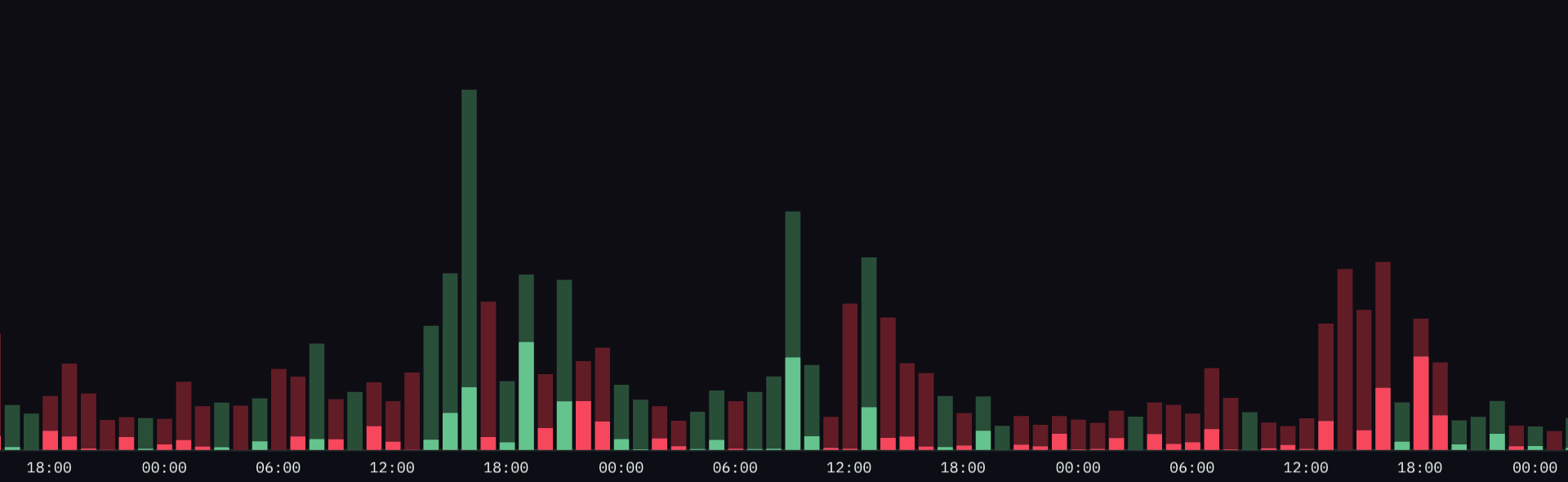
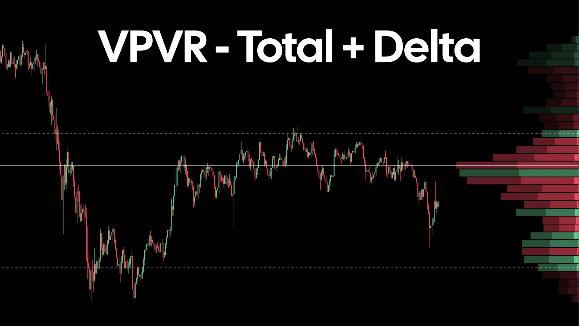
⭐️ Total + Delta Mode
When enabled, the 'Total + Delta' mode provide three distinct layered profiles that collectively together, form one single overall VPVR. Each row is colored based upon the delta recorded at that price level.
-
The darkest profile layer behind all others indicates the total of both market buy volume and market sell sell volume. The width of each of these rows reflect the recorded total volume at each price level.
-
In front, in-between the darkest and brightest profile, is the dominant volume total. If the delta within the row was positive, this is the total market buy volume. If the delta within the row was negative, this is the total market sell volume.
-
Finally, the brightest profile, in front the two previously mentioned, is the net delta recorded for that row/price level. The wider this row, the greater the net delta that was recorded at this price level.
⭐️ Total Volume
As the name suggests, the 'Total Volume' mode will render each row the VPVR profile as one single color. This provides a clean display of each row's width, reflective of the total volume that was transacted at that price level.
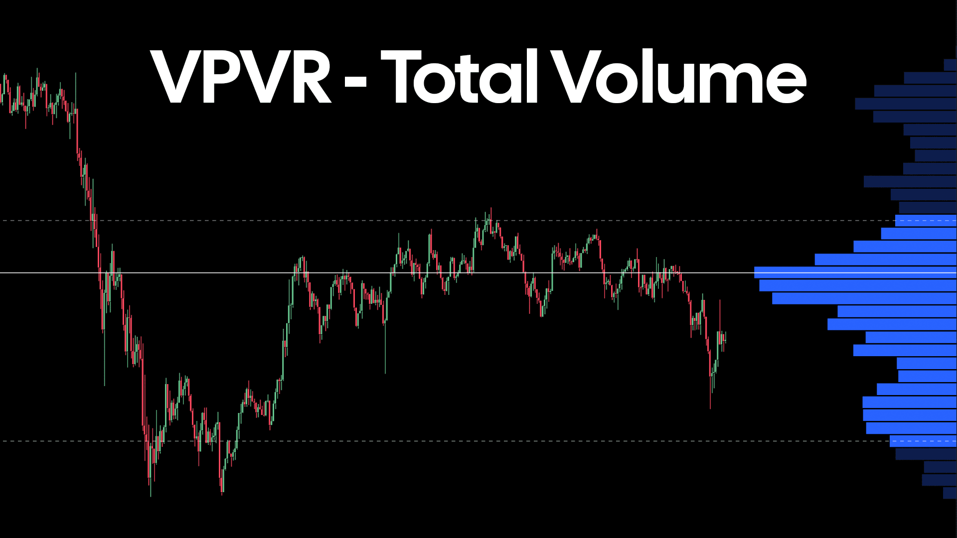
When looking to assess basic total volume distribution over the range in view of your chart, the single color render provided by the 'Total Volume' is arguably visually less distracting that the other modes.
For more detail on these or any of the modes available for this layer, head over to the dedicated VPVR learn article.
⭐️ Values Shown within Row
Depending upon the VPVR mode that is selected, you will now notice values are shown within each row that is within the value area. The value shown within each row will reflect the mode selected; Standard → Market Buy Volume and Market Sell Volume, Total + Delta → Delta, Total Volume → Total Volume. You can toggle these values in addition to changing their color.
🚀 Pane Management
Management of various elements with your Market Monkey Terminal is being extended to your chart in today's update. Within each pane of your chart, you now have the ability to switch and reposition on the fly to your preferences.
This mechanic is part of a wider structural improvements to the base MMT chart. The end goal from this larger improvement process is to allow full flexibility to place & stack various layers and tools on top of one another. This will unlock a far greater scope & range of methods to compare market data.
🐛 Bug Fixes
- Fixed intermittent Footprint rendering issue on 4h time-frame and above.
🧑🍳 What's cooking?
⭐️ New Exchanges! Bitfinex, BitMEX and Deribit are all currently in the process of being added to the Market Monkey Terminal. After this we will look to expand our pair coverage on our supported exchanges. The aim is to cover the top 100 coins by market cap, and subsequently expand from there.
⭐️ Aggregated data across all layers. As the number of layers and tools increase within MMT do does the need to aggregate different data sources. Aggregation often provides a good overview across a range of trading venues, so we intend to offer the ability to mix and match data from different pairs and their respective exchanges wherever possible.
⭐️ Improved Template and Layout management. Equally, the ability to manage your chart templates and MMT terminal layouts needs some love. We plan to overhaul this in the next few release cycles to ensure you spend less time configuring and more time focused on the market.