Heatmap
Introduction
The liquidity environment within a market is in a constant state of flux. The efficiency in which market participants can transact is dictated by the available liquidity within the Order Book.
The larger the value of limit orders at a particular price, the easier in which larger market orders can be executed, without experiencing slippage, and subsequently minimal impact on price. However, the smaller the value of limit order a particular price, the greater the difficulty in which larger market orders can be executed, possibly experiencing slippage, and subsequently having an outsized impact on price.
Limit orders within the Order Book are continuously entered, modified (by size or price), pulled or eventually filled. These flows of limit orders can be witnessed in real-time via a variety within MMT, notably the Order Book and DOM widgets. These are excellent methods with which to watch live changes in the book. However, these methods show only live data. They do not provide a method to view the historical changes within the Order Book over time.
The MMT heatmap combines both the current real-time view of liquidity, whilst also displaying how these changes in the Order Book have progressed over time.
In this article we will explore the MMT Heatmap in greater detail, to ensure you can quickly and confidently assess both historical and current liquidity conditions within the market.
Heatmap Elements
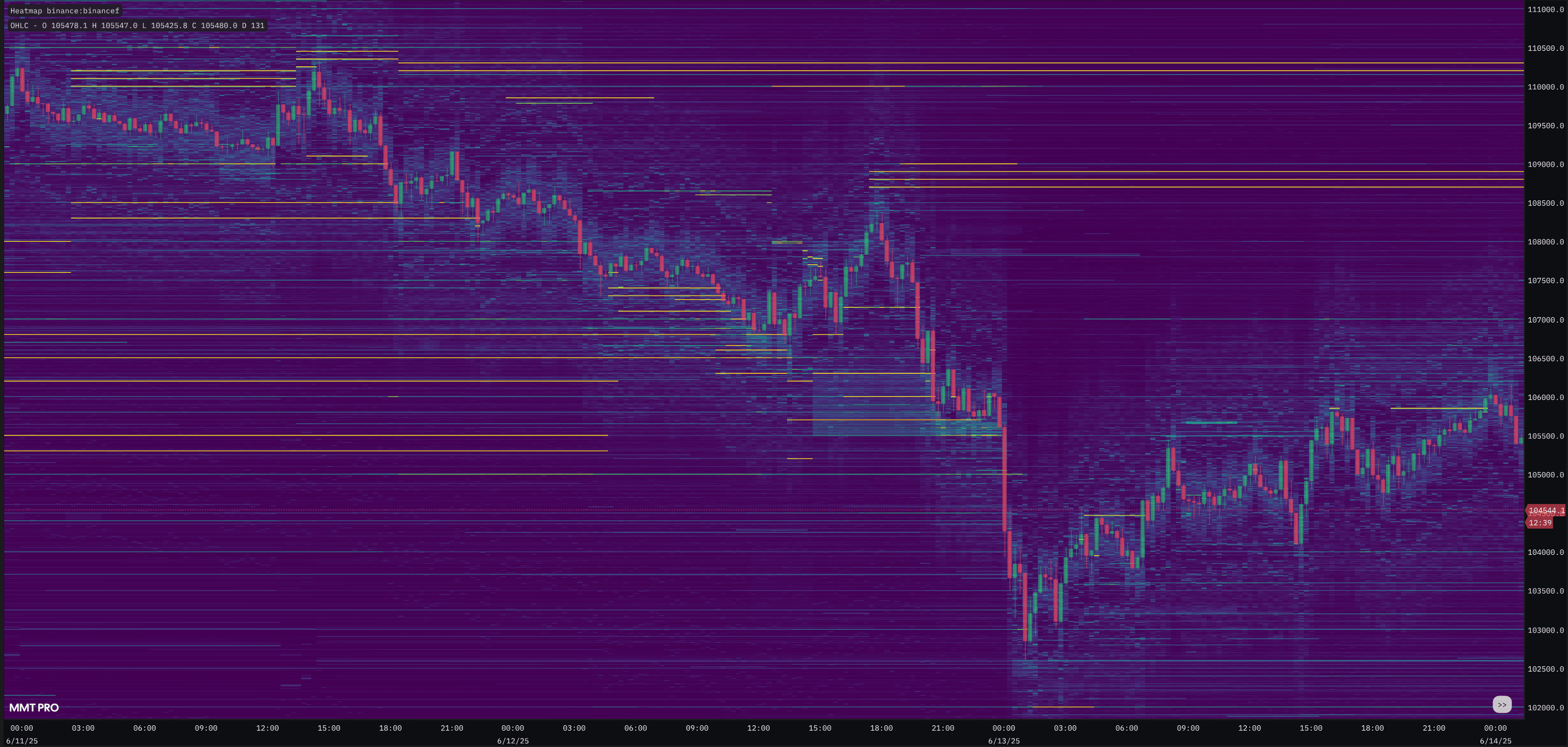
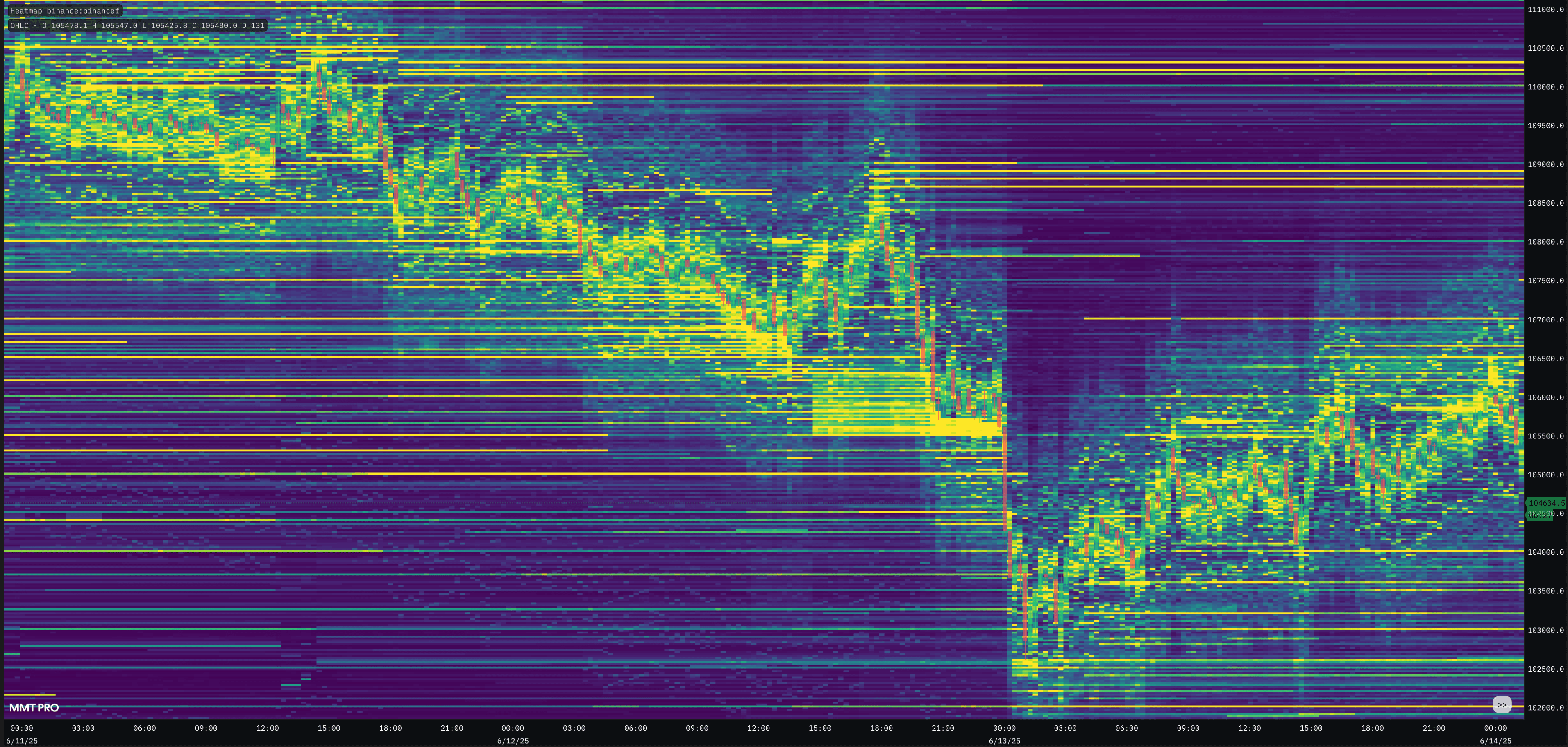
As outlined above, the Heatmap is a visual representation of the Order Book over time. Immediately prior to a candle's close, a snapshot of the Order Book is recorded. These snapshots when stitched together, form the historical heatmap.
Much like the Order Book, each row of the heatmap represents a price group. Similarly again to the traditional Order Book, limit sell orders (asks) are displayed above price, with limit-buy orders (bids) displayed underneath price.
With each new snapshot of the Order Book, the total value of liquidity at each price group is recorded. At the same time, color grading is applied to allow a visual representation of liquidity at each price group. The higher the value of liquidity at a particular price group, the brighter the intensity of that particular Heatmap block.
This grading is also applied on the fly to the current live candle's heatmap slice. You will notice that the bids below, and asks above, the current candle, will flicker with intensity with the live activity of the Order Book.
Activating Heatmap
By default, opening a new chart will automatically add the heatmap layer. If you have removed and wish to re-add the MMT Heatmap layer on your chart, click the 'Indicators' dropdown, and select 'Heatmap'.
Once selected, the Heatmap will intialize and subsequently render across your price chart.
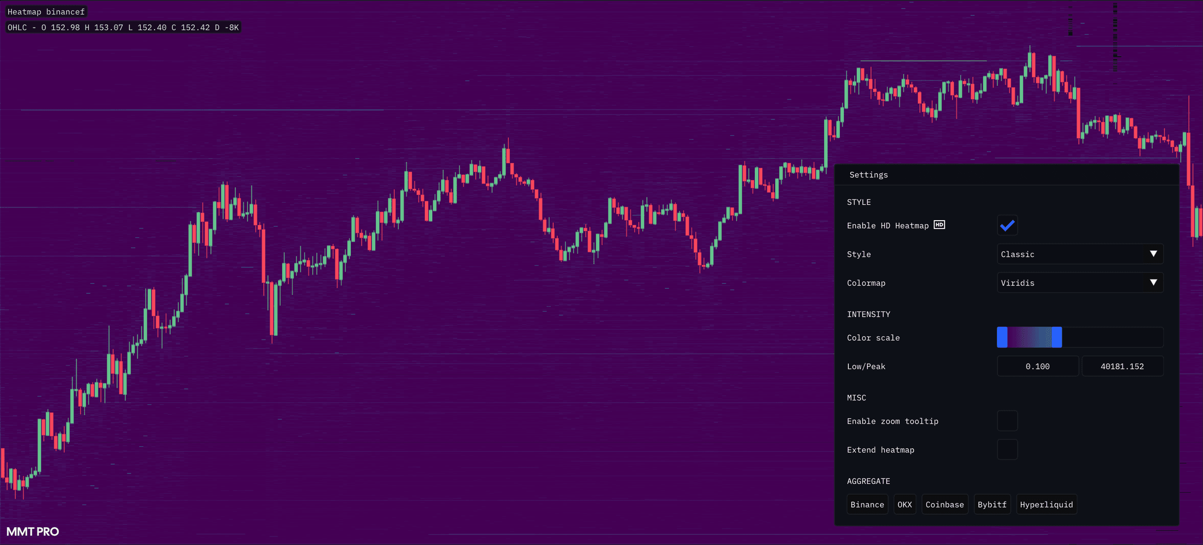
Heatmap Configuration & Settings
The MMT Heatmap settings and inputs should be configured and re-adjusted frequently to reflect to trading workflow. Depending on various factors such as the type of analysis you are performing, the selected timeframe or general market conditions, the heatmap inputs should be adjusted accordingly.
When the heatmap layer is activated, key inputs for the heatmap will be displayed within the Chart widget UI for ease of use. Within the UI includes the Low & Peak inputs, along with the HD/SD toggle. These are both explained in detail below.
Style
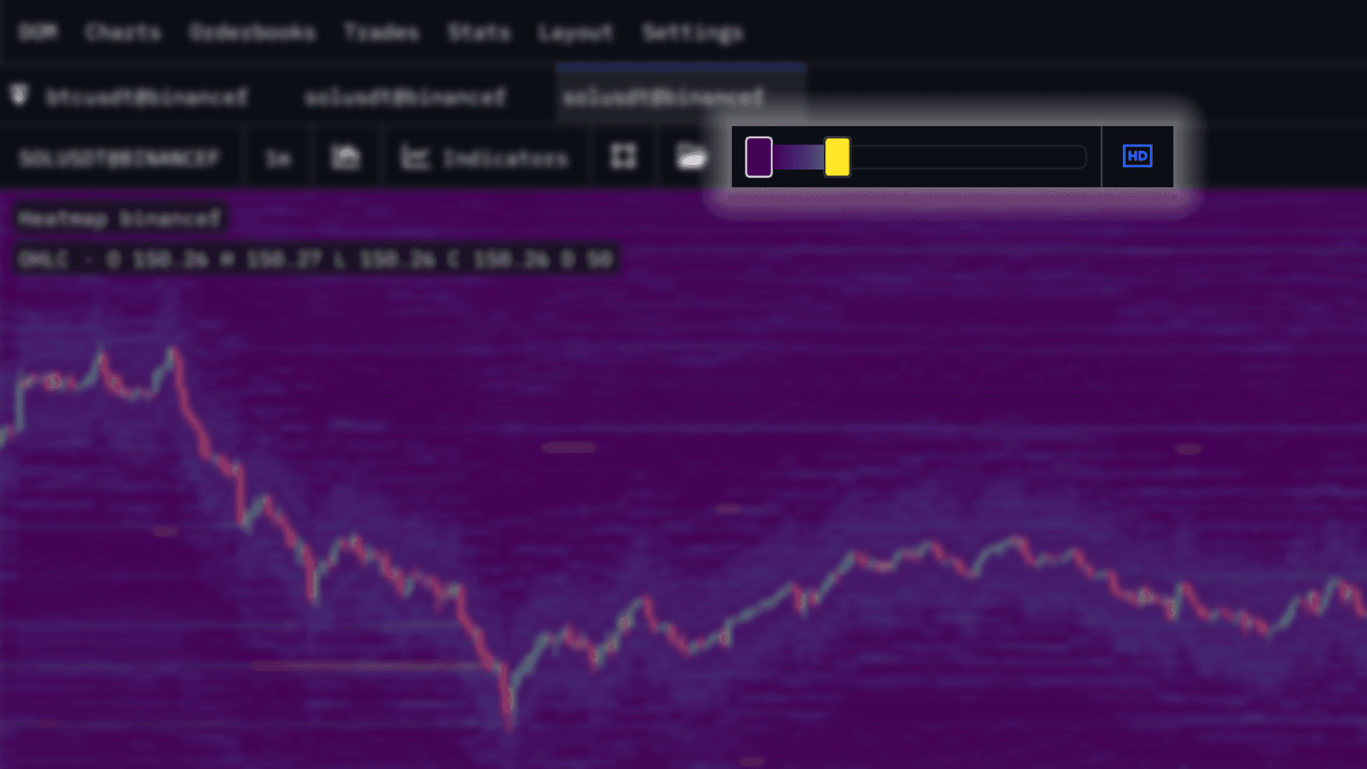
HD/SD Toggle
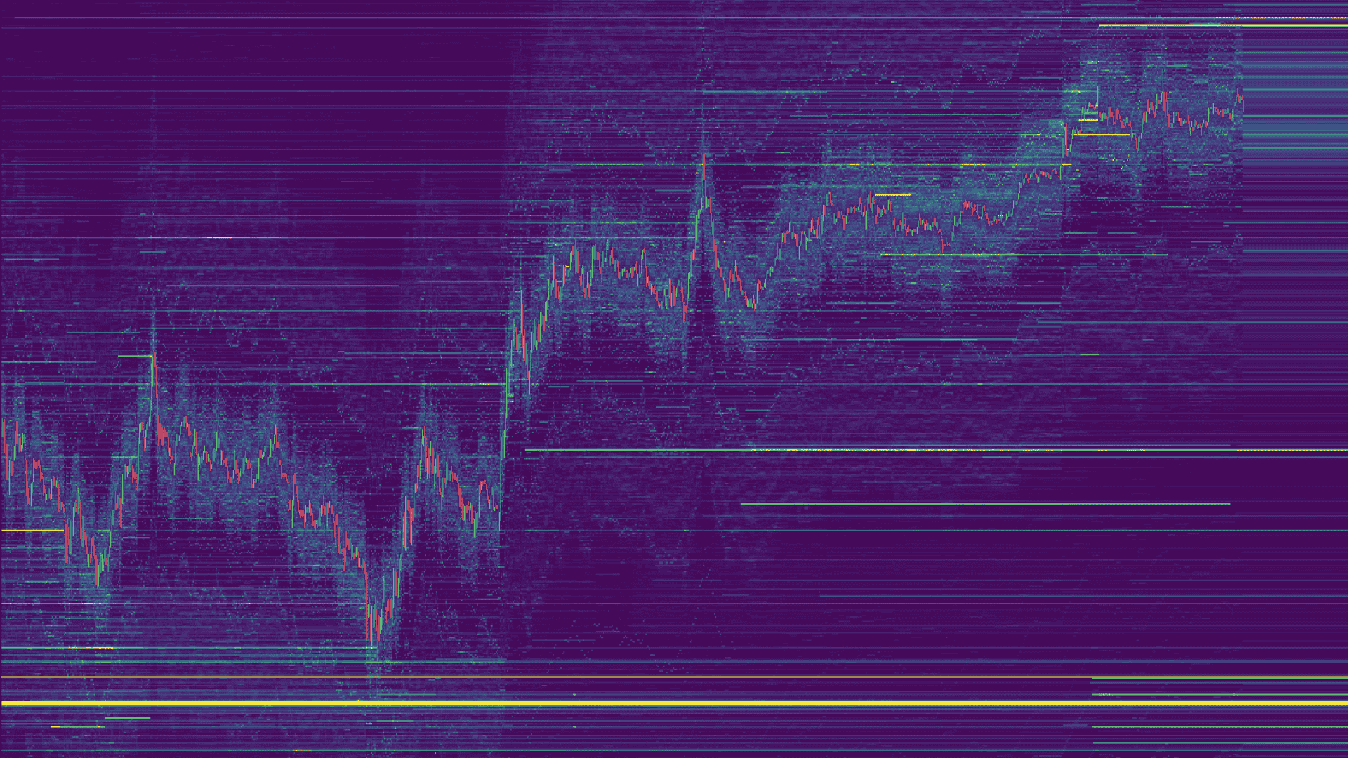
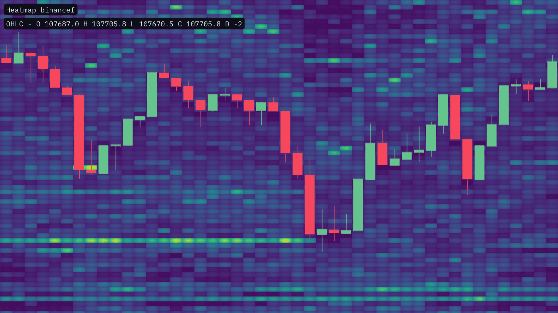
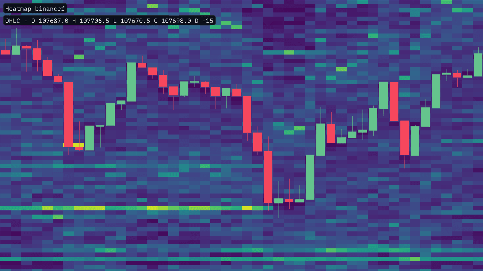
This HD/SD toggle allows you to switch the heatmap bin sizes to suit the style or particular type of analysis you are performing. Here is a quick comparison of the two on BTC:
← SD vs HD →
HD mode will provide the greatest granularity, this is best used when using lower time-frames or wishing to conduct precise analysis.
SD mode on ther other hand, aggregates more levels of the Order Book together so is better suited to higher timeframe analysis
Heatmap Style
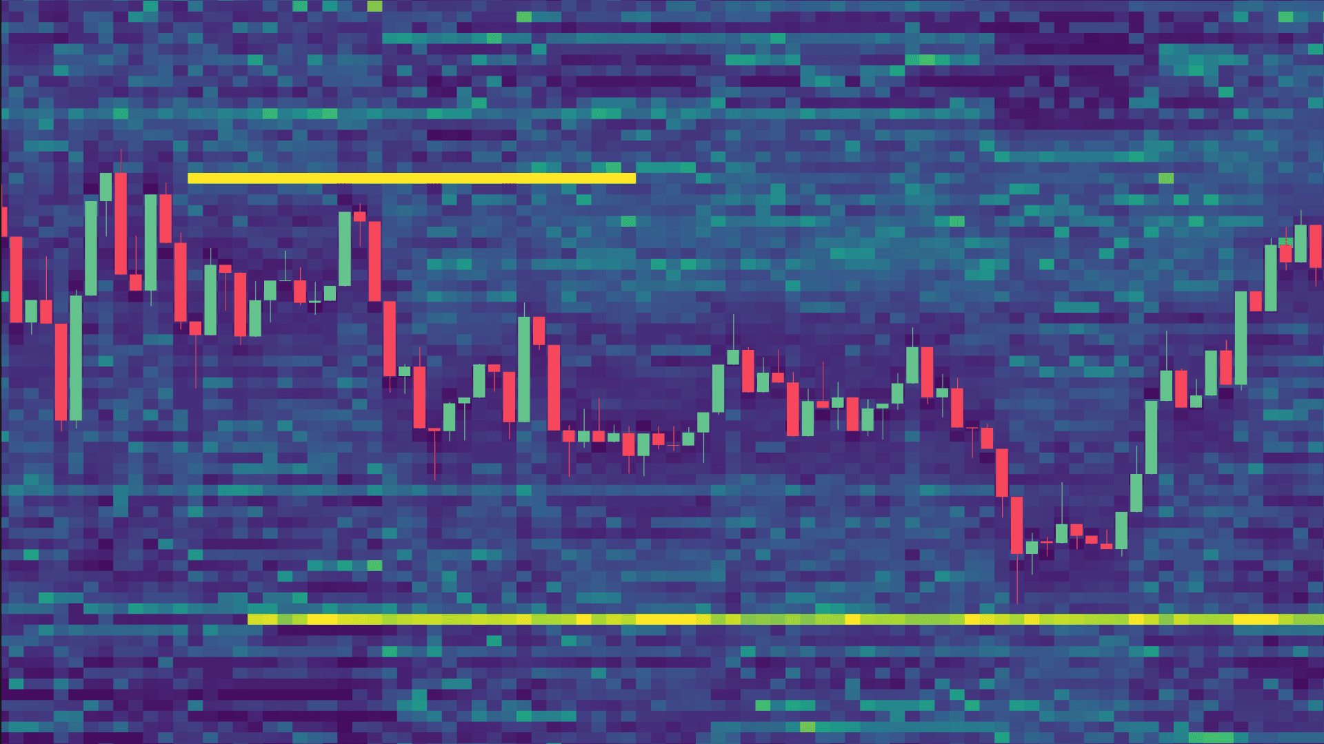
There are three different Heatmap rendering styles to choose from. Classic, Splat & Gaussian Splat. Each of these styles render each heatmap slightly differently. Below is an example between Classic and Splat.
← Classic vs Splat →
The Splat and Guassian Splat when examining a range of historical will produce an alternative rendering styles that some may find useful when combining with other overlay tools to allow greater visual distinction between the original Classic style.
Colormap / Theme
The Colormap gives you the option to change the theme of the heatmap. There are over 25 options to choose from.
The heatmap's themes have had a complete overhaul to ensure that the new shader and the increased granularity of 'HD' mode are best complemented.
Intensity
These configurations will drastically alter how the heatmap is rendered. These inputs will define the how the data within the heatmap is both filtered and color graded.
Low Size
The 'Low Size' slider when increased, will remove all heatmap blocks that contain a value that is less, than the chosen 'Low Size' input.
This is useful if you are seeking to reduce the noise of lower levels of liquidity, within the heatmap.
Peak Size
The 'Peak Size' slider will determine the threshold with which to render the heatmap's intensity. When decreased, the 'Peak Size' will increase the intensity of the heatmap.
The value chosen will determine the threshold in which the most intense color of the Heatmap theme is rendered. The lower the 'Peak Size' threshold, the lower the value of liquidity that is required, to be rendered with intensity.
Miscellaneous
Enable Zoom Tooltip
The MMT Heatmap Tooltip, provides a zoomed-in view of the heatmap as you move your cursor. Think of the heatmap tooltip as a simple magnifying glass.
The Zoom Tooltip allows you to examine particular areas of the heatmap in detail, whilst still maintaining a broader market perspective.
Extend Heatmap
When enabled, the current live candle's heatmap blocks are extended to the right indefinitely. Like the heatmap blocks itself, these are updated in real-time with the Order Book.
This can be particularly useful when wishing to examine the live liquidity conditions within the selected market/s.
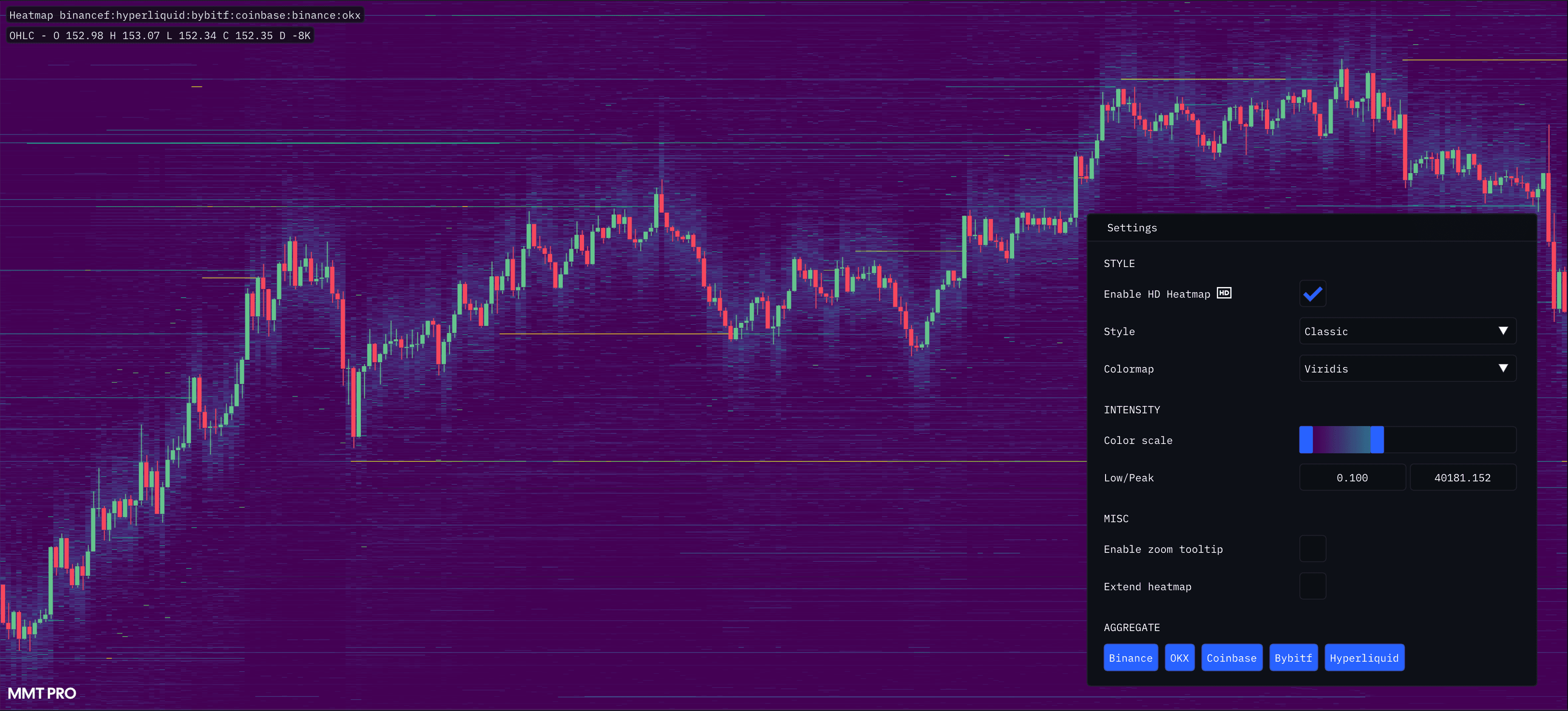
Aggregated Heatmap
With a wide selection of markets from a range of top-tier exchanges, traders using the MMT terminal have the ability view multiple charts simultaneously alongside one another. This allows direct comparisons of the same asset's liquidity differences across trading venues.
← Non-Aggregated vs Aggregated →
The drawback of this approach is the actual process of having to compare visually across multiple charts in real-time. Subtle changes in liquidity on one exchange may not be witness during the process of scanning between markets.
To address this, MMT allows you the ability to combine heatmaps on the fly to create one single unified, Aggregated Heatmap.
Activating the Aggregated Heatmap
Once you have added the base 'Heatmap' Layer to your chart, right-click on the 'Heatmap' label to open the settings menu. Located at the bottom of this menu, are the Aggregated Heatmap Options.
Within this section are the listed exchanges you can choose from to aggregate Order Book data. Each additional exchange added or removed from the Heatmap Aggregation will re-trigger a re-calculation of the Heatmap to reflect your choice
This can be particularly useful when viewing exchanges that publish an extremely limited depth of the Order Book. Trading venues are not created equal, with exchanges such as Bybit, Hyperliquid and OKX choosing to restrict and limit their liquidity/Order Book data. However, Aggregated Heatmaps allow you overlay liquidity from across all markets, crucially providing insight that may be unobtainable otherwise when assessing a single market.