Liquidation Map
Introduction
A cornerstone of MMT has been our full-depth, order book Heatmap. The heatmap overlays the visually renders historical changes in the public order at each price level within the Order Book. The key word in that sentence there is 'public'. Limit orders used to enter and exit a position will be displayed within the public order book.
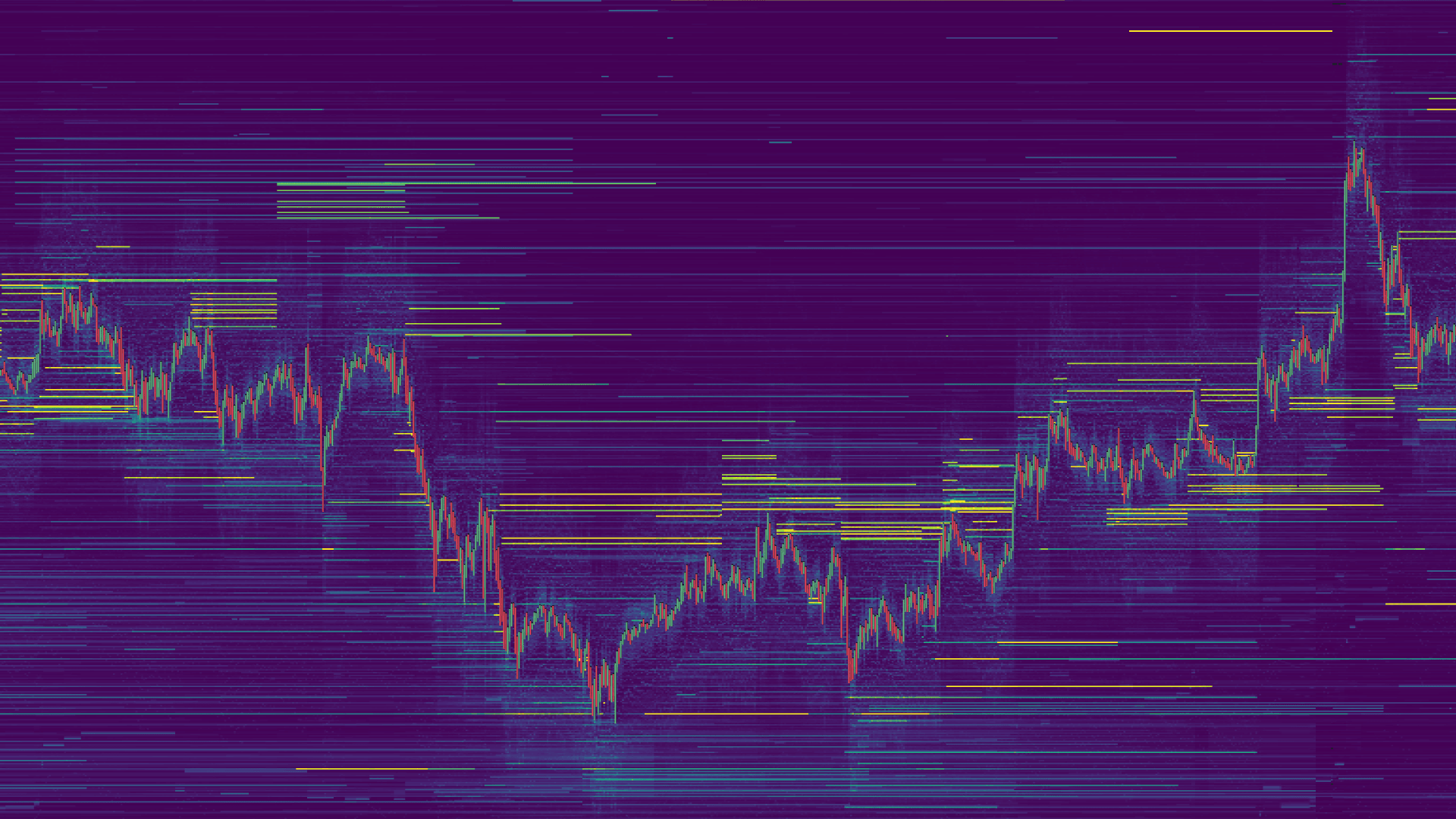
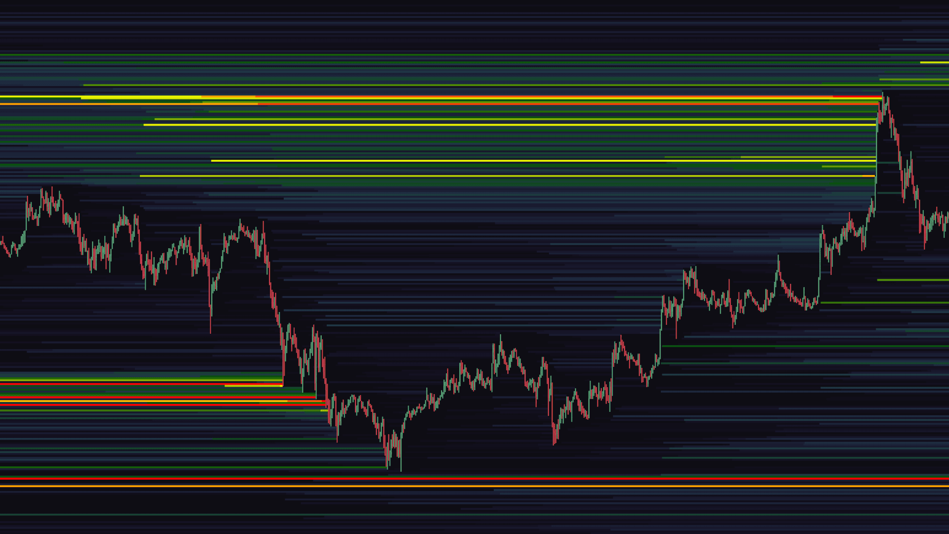
Predicted Liquidation Map vs Public Order Book Heatmap
On the other hand, orders requiring a particular trigger such as stops, take-profits or liquidations are inherently invisible within the public book. These prices in which these triggered orders are known only to trader and the exchange. However, by analyzing patterns within historical flows we can attempt to estimate where such hidden liquidity, not shown within the public order book, may lay.
Liquidation Map Elements
At MMT, live market data streams are parsed in real-time to measure the scale of deviations within flows of the current price action. This measure of deviation is then used to assign a weight to each plot. The weighting assigned is shown by the color grading used for the initial plot.
The greater the brightness or intensity of the initial plot, the greater the proportion of predicted liquidity is skewed more towards potential liquidations. Conversely, initial plots with reduced brightness or intensity indicate that the predicted liquidity is likely skewed more towards potential stop orders.
The MMT liquidation map will still accumulate new subsequent plots, the important distinction, is the initial intensity of each new plot. MMT's approach is designed to predict areas of hidden liquidity of potentially greater significance in the short term, far earlier, than waiting for a linear accumulation of plots.
Activating the Liquidation Map
Navigate to the 'Indicators' button in the top left of your terminal. Then select the 'Liquidation Map'.
Note due to the inherent construction of the Liquidation Map, more data will be populated the more you pan back through historical data. The number of candles in which the render will operate historically is 4,000.
Liquidation Map Configuration & Settings
There are a number of configuration options available for the 'Liquidation Layer'. Below we will explore each one in detail.
Style
Colormap - There are over 20 different colormaps to choose from to render the Liquidation Map. The default color map 'MMT' has been specifically tailored to best show predicted liquidity within the map. Opacity - Simply opacity input for the rendered Liquidation Map. Adjusting this ensures that other layers are not obscured. Extend Levels - Toggling this option will continue the render of all plots to the left, beyond the current candle.
Intensity
Color Scale - This is a dual slider input. The left or 'Low' slider, when moved to the right, will remove predicted liquidity that is more skewed to potential triggers for stop orders. The right or 'Peak' slider, when moved to the left, will increase the intensity in which predicted liquidity that is more skewed to potential triggers for liquidations to occur.
Leverages
Enabled Levels - Incremental levels of leverage can be toggled within the Liquidation Map settings. As you toggle, the render will adjust to either incorporate or exclude the predicted liquidity associated with each level of leverage.
Misc
Tick Per Row - Similar to the range of order flow tools available on MMT, the Liquidation Map also has a dedicated Tick Per Row input. This will determine the price grouping used for each plot of the Liquidation Map. This input should be adjusted to suit the market and timeframe are viewing. A higher value will create larger price groupings.